Storytelling with Data: How to Present Insights Effectively
Introduction
In today’s data-driven world, the ability to analyze data is important—but the ability to communicate insights effectively is even more critical. Storytelling with data bridges the gap between complex analysis and actionable business decisions. It helps transform raw numbers into meaningful narratives that stakeholders can understand and act upon.
Why Storytelling Matters in Data Analytics
Data storytelling enhances clarity, improves decision-making, and ensures that insights are not ignored. A well-presented insight can influence strategy, optimize operations, and drive business growth. Without storytelling, even accurate data may fail to create impact.
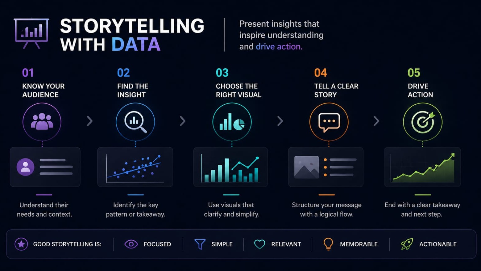
Understanding Your Audience
The first step in effective data storytelling is understanding your audience. Different stakeholders require different levels of detail:
- Executives focus on outcomes and decisions
- Managers look for trends and performance
- Analysts may require technical depth
Tailoring your message ensures that your insights are relevant and actionable.
Focus on Key Insights
One of the most common mistakes is presenting too much data. Instead, focus on:
- Key metrics
- Important trends
- Business-critical findings
Clarity is more valuable than complexity. Always prioritize insights over raw data.
Use Effective Visualizations
Visualizations play a crucial role in storytelling. Choosing the right chart can significantly improve understanding:
- Bar charts for comparisons
- Line charts for trends
- Pie charts for proportions
Tools such as Power BI, Tableau, and Excel can help create impactful visuals.
Build a Clear Narrative
A strong data story follows a structured flow:
1. Problem – What is the issue?
2. Analysis – What does the data show?
3. Insight – What does it mean?
4. Recommendation – What should be done?
For example:
Sales declined by 15% in the last quarter due to reduced customer engagement. Increasing targeted marketing campaigns can help improve conversions.
Keep It Simple and Clean
Simplicity is key to effective communication. Avoid cluttered dashboards and unnecessary elements. Use clean layouts, consistent colors, and highlight important insights.
Add Context to Your Data
Data alone does not tell the full story. Context is essential. Always explain:
- Why something happened
- What factors influenced the result
- What it means for the business
This helps stakeholders understand the bigger picture.
Common Mistakes to Avoid
- Overloading dashboards with too much information
- Using complex visuals that are hard to interpret
- Lack of clear messaging
- Ignoring the audience’s needs
Avoiding these mistakes can significantly improve the effectiveness of your presentations.
Best Practices
- Start with the conclusion
- Use storytelling techniques
- Focus on business impact
- Practice clear communication
Conclusion
Storytelling with data is a critical skill for modern data professionals. It transforms analysis into action and ensures that insights drive real business value. By focusing on clarity, relevance, and narrative structure, you can present data in a way that influences decisions and creates impact.
TL;DR
- Know your audience
- Focus on key insights
- Use clear visuals
- Tell a structured story
- Provide actionable recommendations
All articles
AI & MLApril 3, 2026KYonex Technologies3 min read
Storytelling with Data: How to Present Insights Effectively.
A beginner-friendly guide on how to present data insights effectively using storytelling techniques, visuals, and clear communication.
K
KYonex Technologies
Engineering team at KYonex Technologies